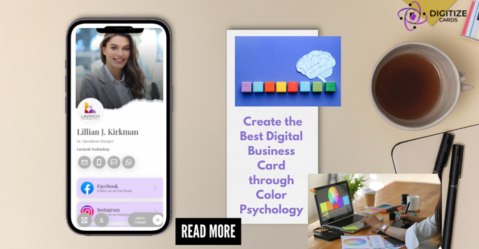
In today’s generation, business cards do not mean a piece of paper being exchanged between two professionals. It is your digital identity, basically brand power. And creating the best digital business card means more than contact details and logos. It’s about leaving a memorable impression. One of the most effective ways of doing so is colour psychology. Emotions and perceptions set the stage for how customers will feel about your brand. Let’s break down how to harness colour psychology for that impactful digital business card.
What is Colour Psychology?
Want to create digital business card? Then you should definitely know about Colour Psychology. It is a term used to denote the study of how colour influences human behaviour and decision-making. Here is a guide to some colours that are commonly used, with the associated psychological effects:
Blue: Associated with trust, professionalism, and dependability. It is very widely used in the business card, as this colour enhances confidence in your brand
Green: This is a colour associated with growth, health, and the environment. Best used for business concerning finance, health and natural protection.
Red: Anything urgent is evoked by the colour red, in fact, this colour gives a stimulus to excitement and energy. You can use it due to its attention-grabbing character, but use sparsely as not to fill the page with it.
Yellow: It conveys optimism, purity, and warmth. It can be effective within creative industries and with forward-looking brands that seek to stand apart from the competition.
Black: Represents sophistication, luxury, and authority. High-end brands capitalise on these and use black for their brands to reflect their exclusivity
Now, let’s see how you can implement these principles to come up with the best digital business card:
Choosing the Right Color Scheme:
Base Colour: Choose a major colour that reflects the personality and values of your brand.
Accent Colors: Use contrasting hues to illuminate key details like your name, job title, and contact details.
Know Your Audience: It is always important to know your target audience before designing your digital business card. Brighter colours might be more attractive to a younger clientele while more conservative colours would be more appropriate for corporate clients.
Keep Contrast and Readability in Mind: The text should read easily in relation to the colour of the background. Such contrast between text and background colours increases the readability of text on digital displays.
Attention by Means of Colour: This would channel more attention to the vitals of your card—the logo or the call-to-action button.
Developing a Memorable Digital Business Card
Tips on how to come up with the best digital business card:
Simplicity is Key: Avoid clutter and excessive use of colours. A clean design with well-chosen colours leaves an everlasting impression
Brand Colour Consistency: Always ensure the colour used is in line with your branding through the logo and the overall visual identity.
Testing and Feedback: Before you go live with your digital business card, test it on different devices, and seek feedback to ensure that it looks nice and does its job.
Conclusion: Digitize Cards, Your Partner in Digital Business Cards
In conclusion, colour psychology really makes a strong way to hack digital business cards. It helps in leveraging the power unravelled in the emotions and psyche by colours, which help craft a card not just to put your information across, but also in such a way as to leave a positive impact on the receiver. Get in touch with Digitize Cards for professional, innovative digital business cards. Their expertise in designing something visually attractive and impactful will help in taking your digital footprint up by notches.
Try these insights in your design of a digital business card, and you will rock marketing. Keep in mind, it is not just your digital file; hence, this is one remarkable opportunity to make an impression that could bind your audience with.


